


We’ve all been on the receiving end of a speaker, who, however well meaning, struggles to engage with their audience and therefore fails to get their message across.
Websites are the same. A bad or even mediocre one can get in the way of the message, no matter how great the product or service.
Like a speaker who captivates you with movement and expression, a dynamic website with a touch of energy can amplify rather than diminish what you want to communicate.
A website with a stylish level of motion and interactivity captures more attention - just as amplified sound is far better at cutting through background noise.

Logo
Actor Base logo - mobile-friendly animation
Menu
ICAT course selection screen, optimised
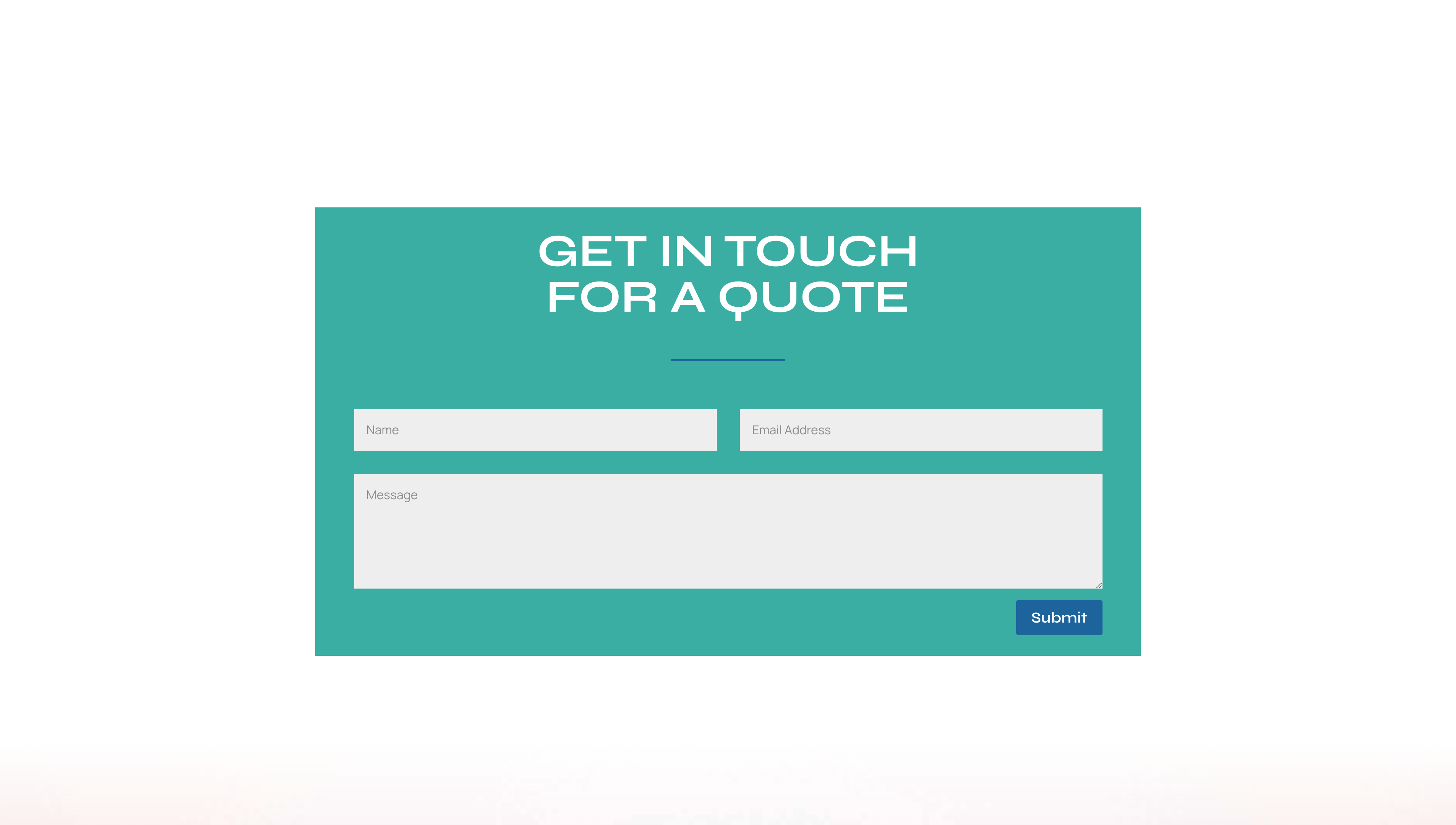
Contact box
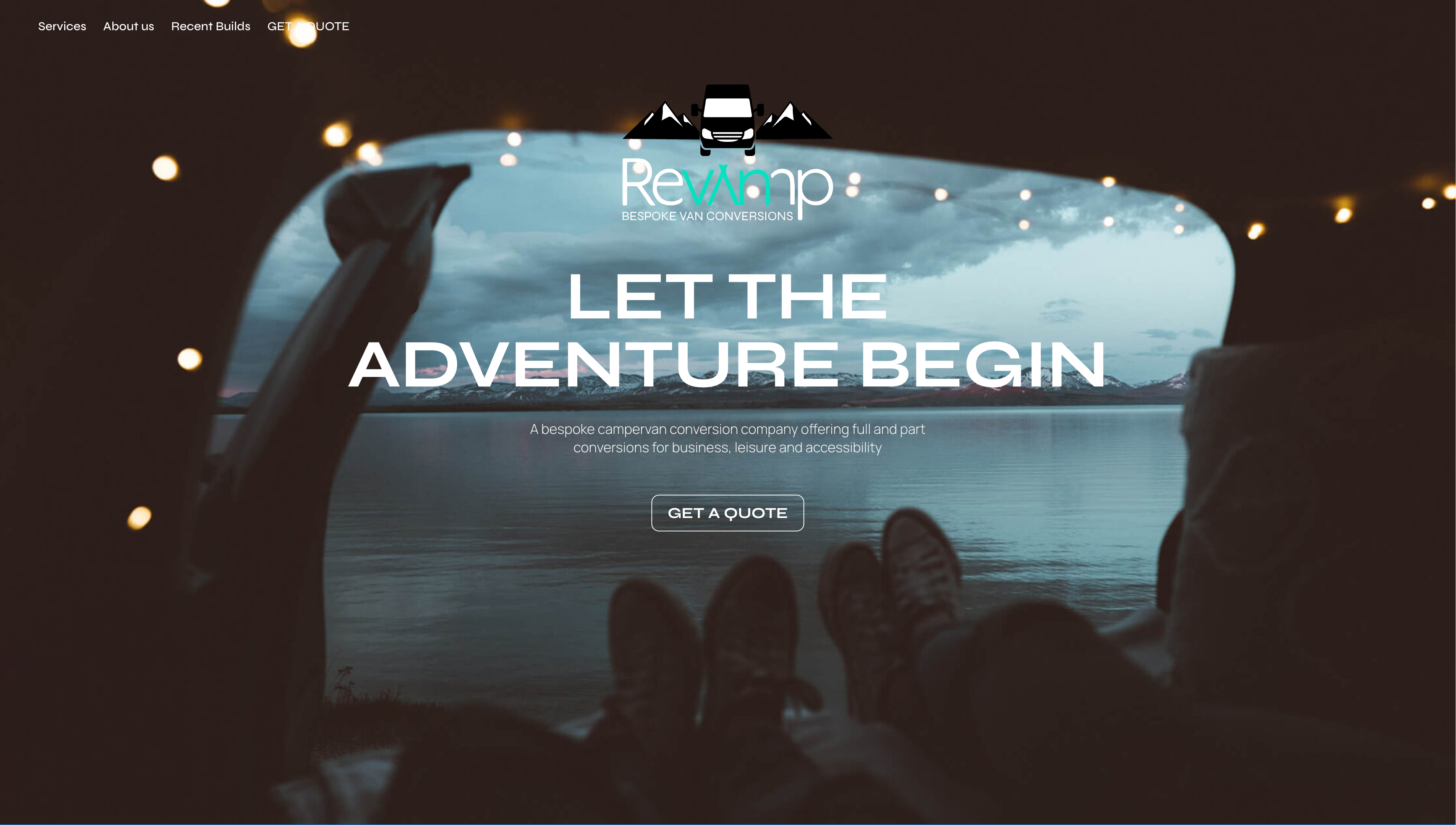
Contact box design for Revamp
Shop UI
E-commerce experiment, Sealsinz (drag to cycle through the products)
Below is a view of an online learning platform built for ICAT (Independant Center for Actor Training). Built on Wordpress and with Memberpress, this enabled the school to pivot during lockdown from a bricks-and-mortar center to a fully online, semi-automated resource.
This online service and community continues to go from strength to strength in both impact and revenue generated.
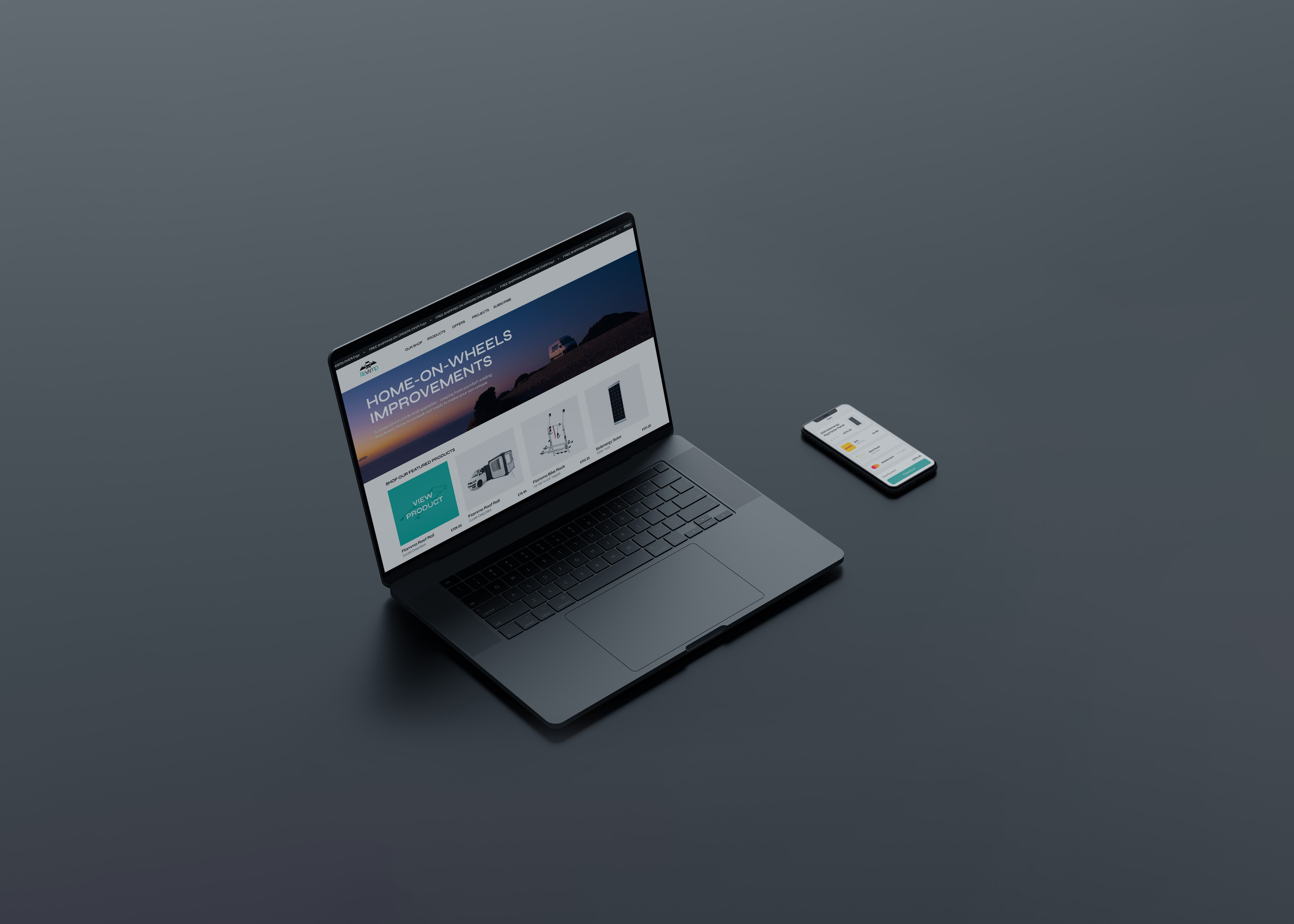
Next, an example of a seamless desktop and mobile e-commerce platform.
Research suggests that 85% of online purchases start on one device and are completed on another, so it's critical that the user experience between methods is as connected as possible, from both a design and functionality perspective.
Finally, the header from the current iteration of the ICAT website.
Some studies indicate that it takes as little as 50 milliseconds (0.05 seconds) for a user to form an opinion about whether they like a site or not.
It's therefore imperative that the first thing they see (usually a header image or video) better be interesting enought to keep them from bouncing straight to another site.


